
Kits 2026: Same Colours, Better Decisions
The 2026 peloton doesn’t reinvent itself. It refines identity, favours restraint, and quietly reveals which teams understand the power of consistency.

Allez TL;DR
The 2026 men’s WorldTour kits don’t reinvent the peloton. They edit it. Less noise, stronger identities – and far less courage than the women’s teams are showing.
Story
Looking at the 2026 men’s WorldTour jerseys as a whole, the headline isn’t change. It’s restraint. Most teams have stopped asking “how do we look new?” and started asking “how do we look like ourselves, but better?” The result is a peloton that feels more coherent, more grown up, and in many cases more confident.
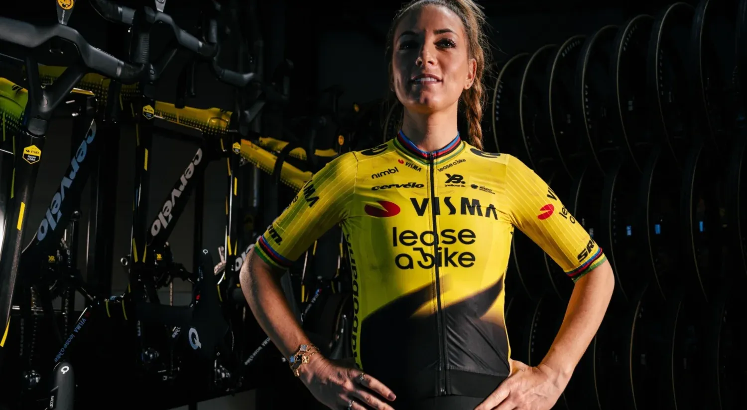
Visma stays firmly in yellow and black. No experiments, no detours. The refinements are subtle, almost invisible, which is exactly the point. It’s a jersey that assumes you already know who they are.
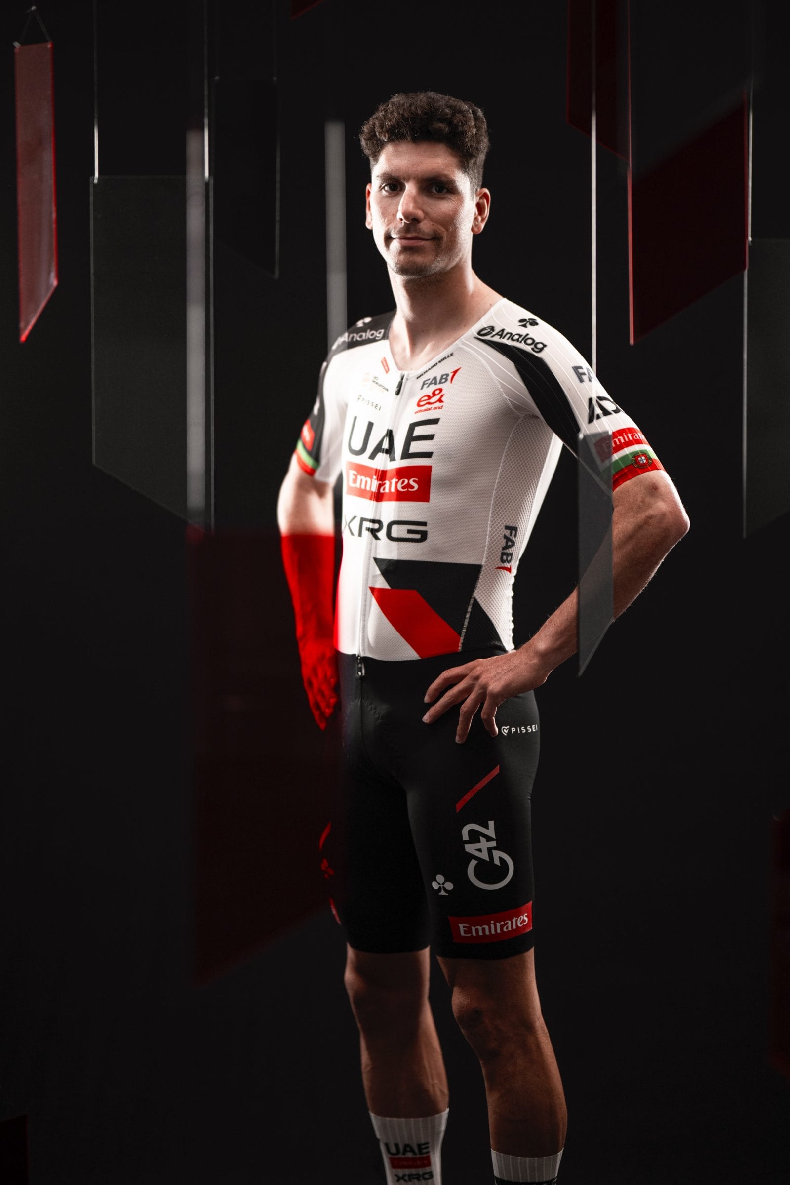
UAE Team Emirates does much the same. White remains dominant, red stays sharp, and everything feels slightly cleaner. Not exciting, but unmistakably UAE. This is a team protecting an identity that already works.
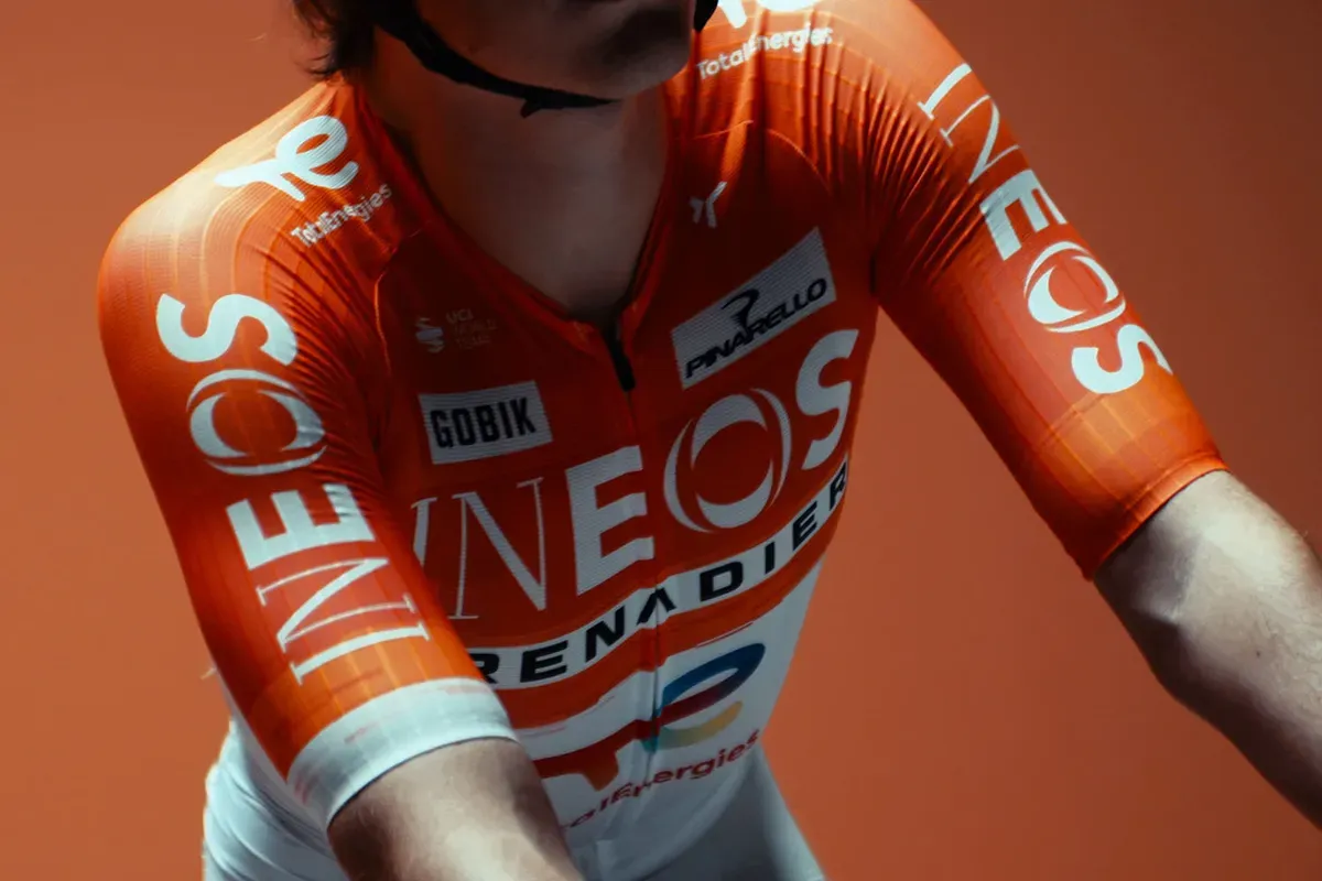
INEOS Grenadiers are the obvious outlier. The orange kit with light shorts is a real break from their past and reads as a deliberate reset rather than a gimmick. It’s not trying to be liked. It’s trying to signal a new phase.
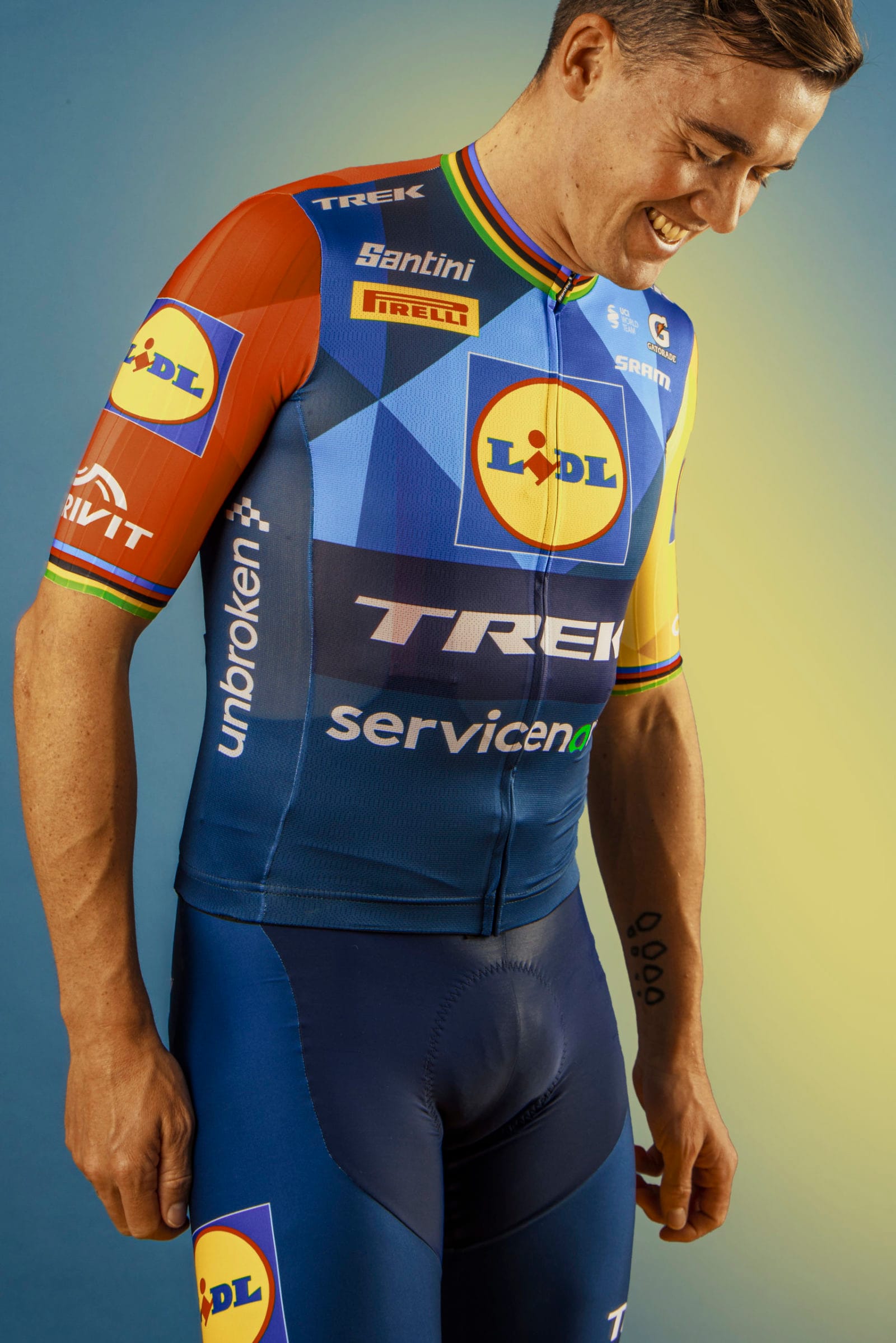
Lidl–Trek continues to be one of the most design-literate teams in the bunch. The colours are bold, but now better organised. The jersey feels like a system, not a collage. It’s loud without being messy.
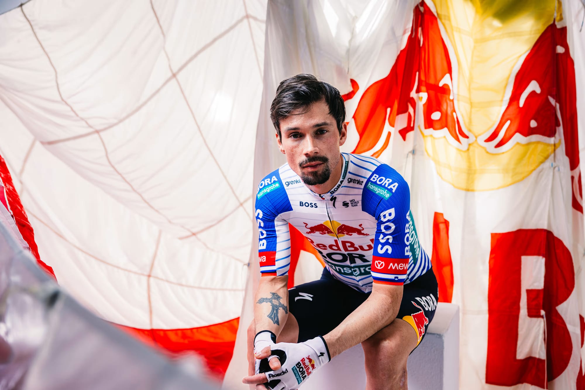
Red Bull–Bora–hansgrohe edges closer to cohesion. The lighter base gives the branding space to breathe, and for once the jersey feels designed around Red Bull rather than overwhelmed by it.
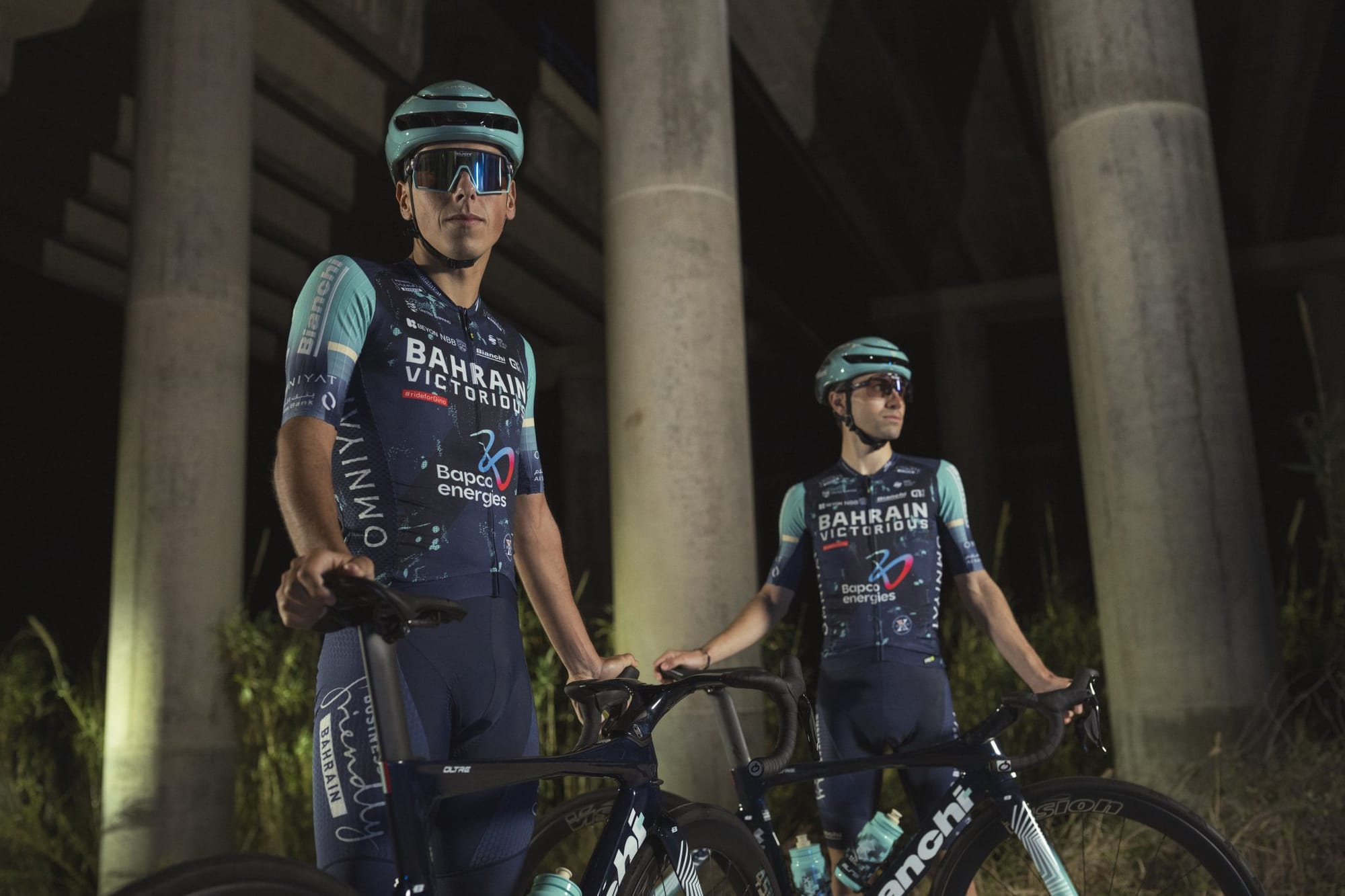
Bahrain Victorious quietly evolves. Darker tones and restrained detailing keep the kit serious and controlled. It won’t dominate highlight reels, but it reinforces a consistent, disciplined identity.
Groupama–FDJ takes the opposite approach: minimal change, maximum continuity. The blue stays blue, the red accent remains familiar. Conservative, yes, but identity-building over time.
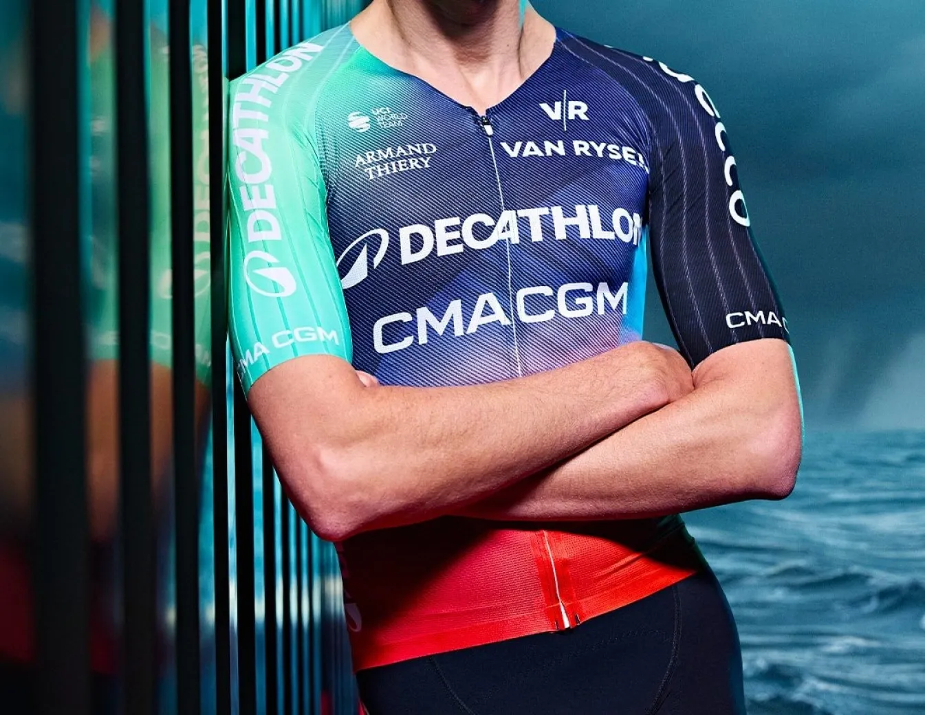
Decathlon–AG2R La Mondiale continues its slow transition. The gradients and colours are still there, but calmer and less restless. It feels like a team settling rather than searching.
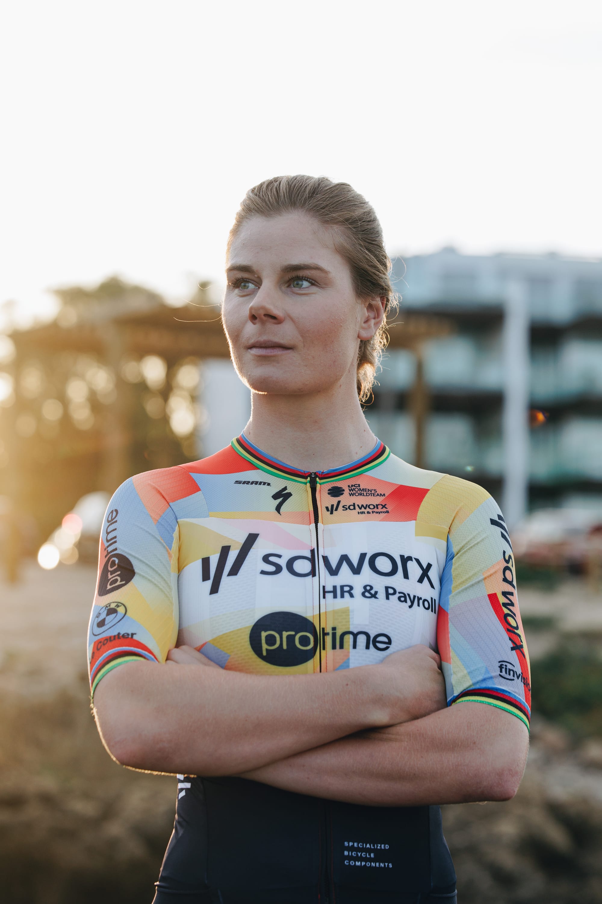
SD Worx–Protime stays punchy and modern, leaning into strong colour blocks and a confident graphic language that mirrors their dominance. It looks fast, intentional, and very sure of itself.
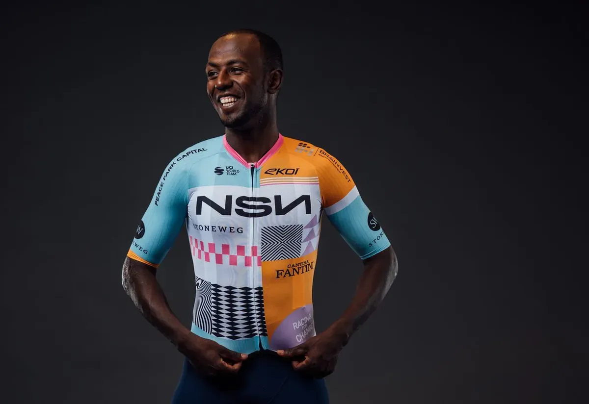
NSN Cycling Team brings more personality than most. The geometric references and bolder composition make it stand out without drifting into novelty. It feels culturally rooted, which remains rare in the men’s peloton.
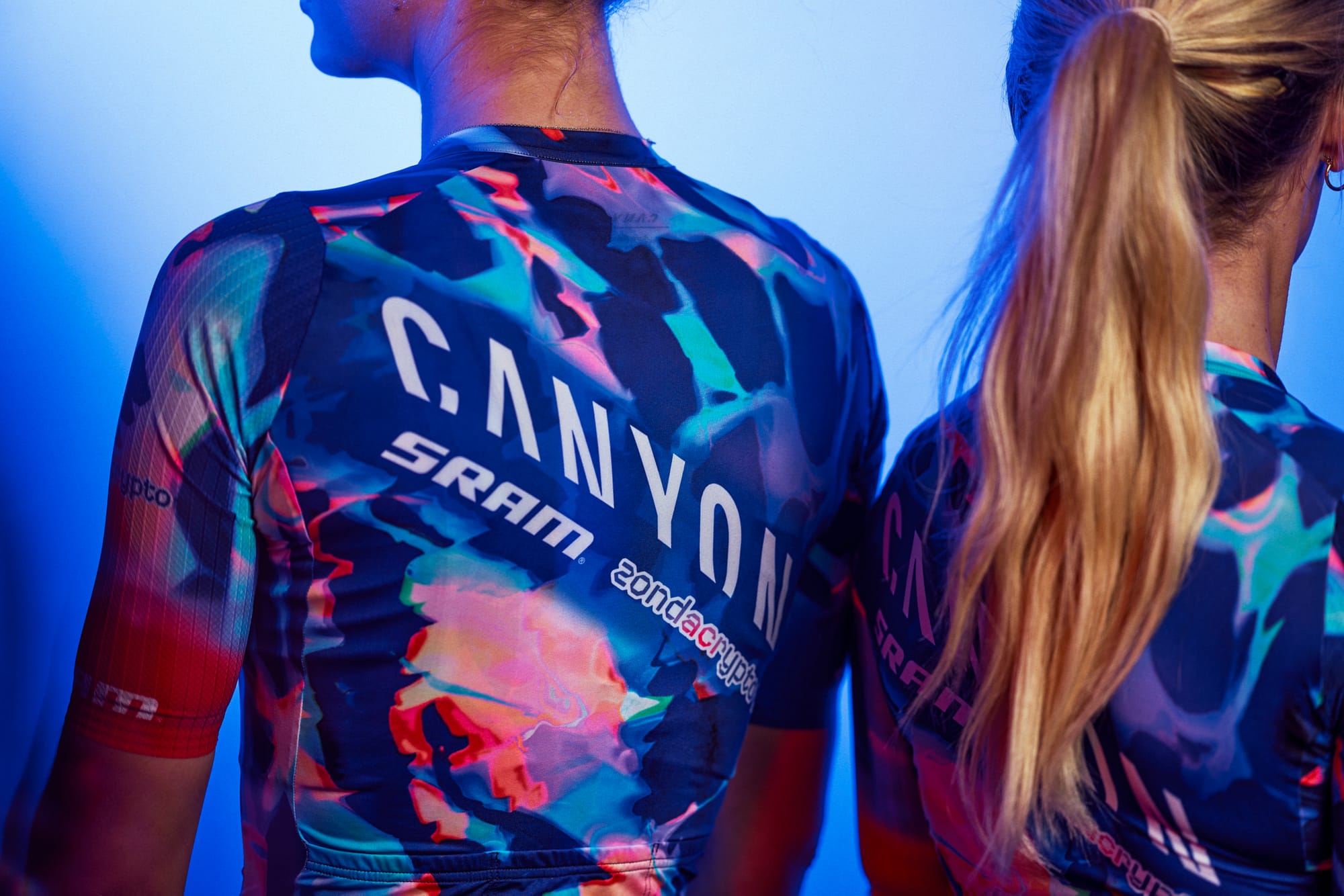
Canyon–SRAM zondacrypto shows what happens when a team truly commits to expression. The 2026 kit is rich, layered, and unapologetically bold, built around deep purple with flashes of light and colour. It feels less like a uniform and more like a statement of intent.
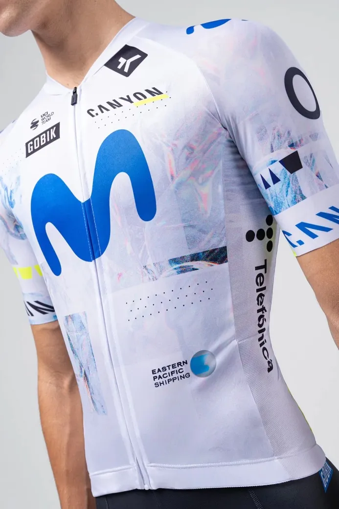
Movistar goes the other way. The predominantly white kit strips things back and lets the iconic blue “M” breathe again. A quiet reset that trades visual noise for heritage and clarity.
And that contrast is telling. While the men’s peloton largely chooses caution and optimisation, it’s often the women’s teams that push visual language forward. There’s confidence here in the men’s kits, yes – but very little risk. One can’t help but feel the peloton could afford a bit more courage.
Why it matters
For years, WorldTour kits drifted toward visual overload. In 2026, teams are correcting course. This isn’t about trends. It’s about brand memory. The strongest kits are the ones you don’t need explained – but the most memorable ones still dare to surprise.
Pattern to watch
Less experimentation. Fewer gradients. Stronger commitment to established colours and cleaner sponsor hierarchies. Longevity is winning over launch-day buzz, even if creativity is paying the price.
Sometimes confidence looks like doing a little less. Sometimes it looks like daring to do more, Allez!